How To Increase Ecommerce Sales (18 Actionable Steps You Can Take)
I am an affiliate with links to an online retailer in this blog post. When you read what I have written about a particular product and click on that link and buy something from the retailer, I can earn a commission. Please note that I only recommend products that I truly believe in and use in my business. Please read my full disclaimer here
 The first time I started my Shopify store, I flopped.😢
I had very low sales conversions. Most people do not realise that the problem is not so much that people do not want to buy from you. It’s simply a matter that they do not trust your store.
When I studied other people’s stores and got advice from a few other Shopifiers, I realised what I was doing wrong. So I am writing this post to help other eCommerce store owners understand what they need to do to improve their store and start getting sales.
When I did a total revamp of my store I went from $0 in sales to $7.5k in sales in just one month. You can read my success story here.
This is exactly what I changed and what you can look out for or add to your store to make it better.
18 Actionable Steps To Increase Ecommerce Sales In Your Online Store
#1 About Us Page
Your About Us page does not have to be personal. It does not have to show the person running the store if you do not want to. But a paragraph or two about what your store represents, the history of the store and where it’s going is a good place to start.
#2 Contact Us Page
If your store is just getting on the scene you want to offer a way for people to contact you in the event that there is a complaint. One of the things that boosted my conversions by 27.5% was including a telephone number and an email address.
Make sure that the email address is a professional email address, so not Hotmail or Gmail. I used Namecheap to buy a domain and then added the private email feature as an add on.
For my phone number I purchased an internet number from Grasshopper.com. Whilst I did not have that many calls on the number, I did have a few which went to voicemail. I never answered phone calls but screened every call and then returned each one at a later time during the day.
#3 A Refund Policy
This is mandatory if you want to have a professional-looking store and to gain trust from your visitors. Customers are more inclined to make a purchase if they know that they are protected in the event that they are not satisfied with their purchase. A refund policy also sets out your store’s terms and makes it clear when you will accept a refund so there is no dispute if anything goes wrong.
#4 A Shipping Policy
Make it clear when customers are likely to expect their purchase. Most customers abandon a purchase when there is doubt as to when an item is to be shipped and delivered.
You may also want to consider offering many items with free shipping. If customers have added an item to cart and then abandoned their purchase at the checkout it is more than likely that the shipping cost was an issue. To solve this problem of having too many abandoned carts I removed the shipping cost completely or reduced the price of my shipping. Most eCommerce store owners, compensate for the free shipping by increasing the price of the item. So you can offer an item for $24.99 with free shipping or $20 + $4.99 shipping.
#5 An FAQ page
It is important to make your store look as trustworthy as possible. Including an FAQ tab to my store helped improve my conversions by 13%. Sometimes a customer may have a question about an item that can be addressed immediately with an FAQ section.
I realised that this was important when I sought feedback from a customer who did not immediately purchase an item. She said “I was not sure what rolled canvas meant as opposed to framed so I changed my mind”. I therefore immediately added an FAQ section addressing any possible questions that my customers could have. I also saw from my Google Analytics that the FAQ section was most frequented immediately before the customer proceeded to checkout so I know this was an ideal step to take.
#6 Trust Badges
There is a perceived sense of security when you see a trust badge on a store. I tested placing the trust badge on the footer of my store page but found a greater effect when I included it under the Add to Cart button on my product page.
![]()
Trust badges and seals, build trust with your customers. It acts as a stamp of approval that your store is secure or the product is of a high quality. This is what IiGears trust badge and seals look like.
![]()
Some companies like Norton AntiVirus, McAfee offer trust badges when your site is tested with their systems. You can also download trust badges from Google Images.
#7 Product Descriptions
I found that simple product descriptions worked better with my store. It is important to test whether long or short product descriptions have any effect on add to cart conversions.
A good way to test this is to have two ads running to two different product descriptions for the same item and see which one gives you better conversions. When tested I found that precise product descriptions won. The objective I wanted to achieve was to have the customer spend as little time on the product page as possible. I wanted as few distractions as I could have the customer subject to, so they could make up their mind, add the item to cart and then checkout. Everyone’s store is different so make sure and test with your store.
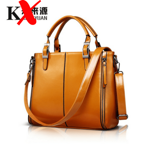
#8 High Quality Images
If you have stock of your products it is a good idea to take high quality pictures of the image. Make sure that the image is large and clearly displays the product. If you are dropshipping and using images from AliExpress or Alibaba as in the below imagery, remove any Chinese symbols or branding from the image.
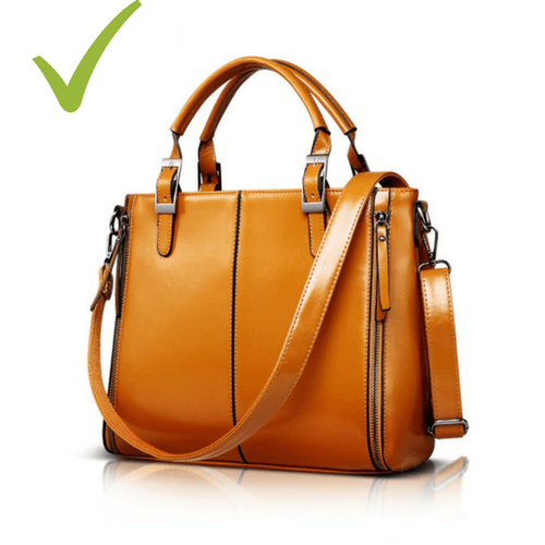
Too many images on the product description can act as a distraction to the customer so try to portray the product carefully in as few images as possible.
#9 Customer Reviews
Having customer reviews added a huge boost to my ecommerce sales. I found that my sales improved by 19% with customer reviews having tested a product page with no reviews against one with reviews.
Customer reviews acts as social proof and to the customer it simply means that people do buy from the store so it can be trusted. Secondly they get to see the opinions of other people before they purchase the product. As a new store owner it may be difficult for you to get reviews in the first place. A work around is to add a few reviews yourself until you start getting reviews from your customers. When customers do purchase make sure and follow up with them to ask for a review.
#10 Remove Social Share Buttons
As an eCommerce store owner the main goal for your customer is that they visit your store, see the product that they want and make a decision to buy or leave the store. Therefore avoid anything on the product description page that distracts the customer. Social share buttons were one of those things that I removed. I wanted for my customers to remain in my store as opposed to being taken away from it by a request asking them to share the product with their friends.
#11 Check The Color And Size Of Your Add To Cart Button
In my old store my add to cart button was small and blue. In my new store it was large and green. I wanted the call to action to be bold and clearly visible. I also wanted a colour that represented the will to move forward such as with a green traffic light.
I am not sure whether the change in the colour of the button had any impact on sales but it was one of the things I did differently for my store. The colour of call to action buttons sometimes have an effect on our buying intent. According to The Amasty Blog, “colour does mean something” as they scrutinised dozens of eCommerce stores to see what other owners were using.
If you are starting your own eCommerce store, do not assume that the colour green or blue button will work well. It is important to test button colours to see which one works on your product page and with your audience.

#12 More Than One Payment Option
I used Stripe as my payment processor for my eCommerce store however you may find it beneficial to have more than one payment option. Some customers feel that a transaction is more secure when they use PayPal because of PayPal’s Buyer Protection. If you find that customers are adding items to their basket but not completing checkout then it may be because they do not prefer to use your chosen payment processor. Therefore you may wish to consider adding more payment variations if conversions from add to cart to checkout are low.
#13 Product Options
I limited my product options to just 5 variations. There were so many things that I learnt when I did over my store and one of them was that I should never offer the customer too many options. Too many options mean confusion and overwhelm for the customer. This is true when it comes to the colour of items. With too many options they may not be able to make up their mind. So to avoid this keep variations in small quantities. I would not recommend having more than 5 variations.
#14 A Logo
Adding a logo to my store displayed professionalism and gave a finished touch. A logo does not need to be fancy. It can be created using PicMonkey or Canva and can be as simple as including acronyms to represent your store’s brand.
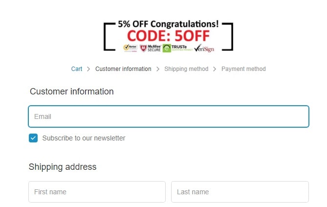
#15 Discount Code on The Checkout Page
I offered an additional 5% off on the checkout page by providing my customers who reached the checkout page with a discount code. This increased my ecommerce sales conversions by 6% and is a nice little way to seal the deal with the customer.
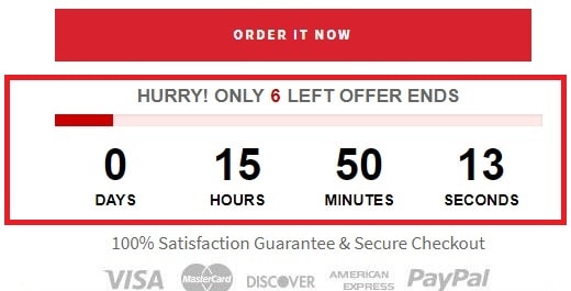
#16 Scarcity or Urgency Apps
There are apps on the market that you can install on your store as a strategy to increase a sense of urgency. For example, apps that show that an item will be sold out or that the price will increase.
I found that by including the Hurrify Countdown timer from Shopify to my store, caused people to complete their purchase straight away instead of going away and thinking about it.
For example I had a bracelet on sale in five different colours. The customer only bought one even though she could have purchased all five for the price of four. I contacted the customer later on to offer her the five for four deal and asked why had she not chosen this option just to get her feedback. She replied that “I really wanted to get the bracelet for my granddaughter and had to make a quick decision because the timer was going down”. If you are using Shopify check their app store to look for apps that add this feature.
#17 Abandoned Cart Follow Up
Shopify has a feature where you can send an email to a customer fifteen minutes after they have abandoned their cart reminding them to return and finish their purchase. Using this feature I found that 32% of my customers came back to complete their purchase.
Never assume that a customer has not completed their purchase because of the price.
To recover abandoned carts I decided to request telephone numbers from my customers at checkout. This helped me contact the customer in the event there was a query I had before I shipped the item. I also took advantage of this and contacted any customer who did not complete their purchase to find out why. I was actually surprised to find out that three in five customers did not complete their purchase because their phone rang. One in five did not complete their purchase because they got distracted by the television.
#18 Simple Store
Finally, in my first store I had a carousel slider on my front page and was so focused on making it perfect and pretty. In my second store I realised that none of that mattered. I created a super simple storefront where all the products were listed so that the customer could easily view the product of their choice and got better conversions. My advice, keep your stores simple. You do not need any fancy designs or to spend a decade trying to perfect your store.
That’s It!
If you are having trouble converting your visitors into sales then it is more than likely there is an issue with your store, your product description page or your check out process. Hopefully the mistakes and changes I made to my store can help you identify what needs improvement so you can drive more sales into your store. Good luck!
Cheers,

 Previous Post
 Next Post